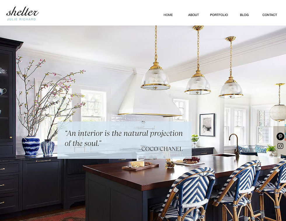
Designing a website for an interior designer is a bit like building a house for an architect. You can’t gloss over the details. Every spacing choice, every font weight, every image crop has to be deliberate.
Julie Richard came to the project with a trained eye shaped by years of balancing texture, proportion, and light. As her business evolved, she was ready for a refined website refresh and a subtle logo update to match the sophistication of her work.
While many clients trust the process, she examined it closely, which ultimately made the work better. The site could not simply look nice. It had to feel curated. The updated branding and digital presence needed to align seamlessly, creating an experience as polished and intentional as her interiors.
Portfolio Images
Selecting the photography was its own curation process. Every image had to earn its place and reflect both range and restraint. We chose a balanced mix of close ups that highlighted texture and craftsmanship, and wide shots that allowed light, layout, and flow to speak for themselves.
Typography
Typography required the same level of care. We selected a headline font with quiet authority and a body font that felt refined yet approachable. Spacing, scale, and hierarchy were adjusted until everything felt balanced and deliberate.
The End Result
The final website became a true extension of her design philosophy. Clean and intentional in its structure, it was designed to support work that can be both refined and boldly expressive with color. The framework stays disciplined so her interiors can take center stage, allowing their richness and personality to shine without distraction. When she said it felt right, it was the highest compliment.