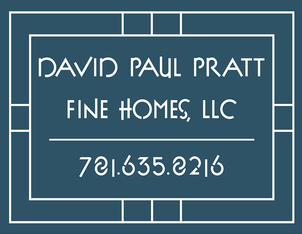
Designing the logo for David Paul Pratt Fine Homes began with a clear vision: he wanted it to reflect the architectural style of Frank Lloyd Wright. That meant strong horizontal lines, balanced geometry, and an understated elegance that feels intentional rather than ornate.
The final logo carries that architectural influence in a way that feels elevated and refined, aligning with the caliber of homes he builds and the high-end clients he serves and hopes to attract. Its structure suggests craftsmanship and permanence, while the clean, confident design communicates thoughtful planning and attention to detail. He also asked for a version specifically designed to work on lawn signs at his build sites, ensuring the branding translated clearly and boldly from paper to property. It signals that these are not simply houses, but carefully designed homes built with purpose and lasting value.